Learning Plataform
A responsive learning platform and mobile app developed for an edtech company

Overview
Every year, about 5.8 million Brazilian students take the ENEM (National High School Exam) and other similar tests to gain admission to college. To support their preparation, the company offers an online learning platform.
The goal of this project was to improve the platform’s interface, making it more intuitive, user-friendly, and responsive. We also worked to ensure accessibility on both the Apple App Store and Google Play Store, allowing students to study anytime and anywhere.
My role
I worked on this project from 2019 to 2021, starting with hands-on design work and later moving into a leadership role. My responsibilities included leading the discovery and ideation phases, improving the platform interface, and defining a new application design. I also initiated documentation for the company’s design system.
As the project evolved, I transitioned to guiding and mentoring other designers, ensuring a consistent, high-quality experience for students across devices.
Discovery
The development of the new platform unfolded in several stages.
To understand the project’s context, I immersed myself in the product, the solution it aimed to offer, and the students’ needs. The challenge was to enhance the platform without disrupting their established study routines.
User Persona
Ana, 22 year-old student - São Paulo.
Ana is applying to a public university for the second time, pursuing her dream of becoming a cardiologist. She is committed to her studies and enjoys spending her free time with family, scrolling through social media, and watching TV.
Top Goals
• Begin higher education
• Start a career in medicine
• Achieve financial independence
Frustations
• High cost of preparatory courses for medicine
• Commuting long distances to attend classes
• Falling behind when a class is missed

"My dream is to wear a white coat when I graduate from USP (University of Sao Paulo)"
Defining
One of the main challenges students faced was keeping track of their weekly class schedules and related materials. To address this, we developed the Study Plan feature, giving them a clear, organized view of upcoming lessons and resources.
I also researched competing solutions and interviewed experienced team members to gather insights from their direct interactions with students. These findings informed both immediate feature improvements and a roadmap for future enhancements.

Developing
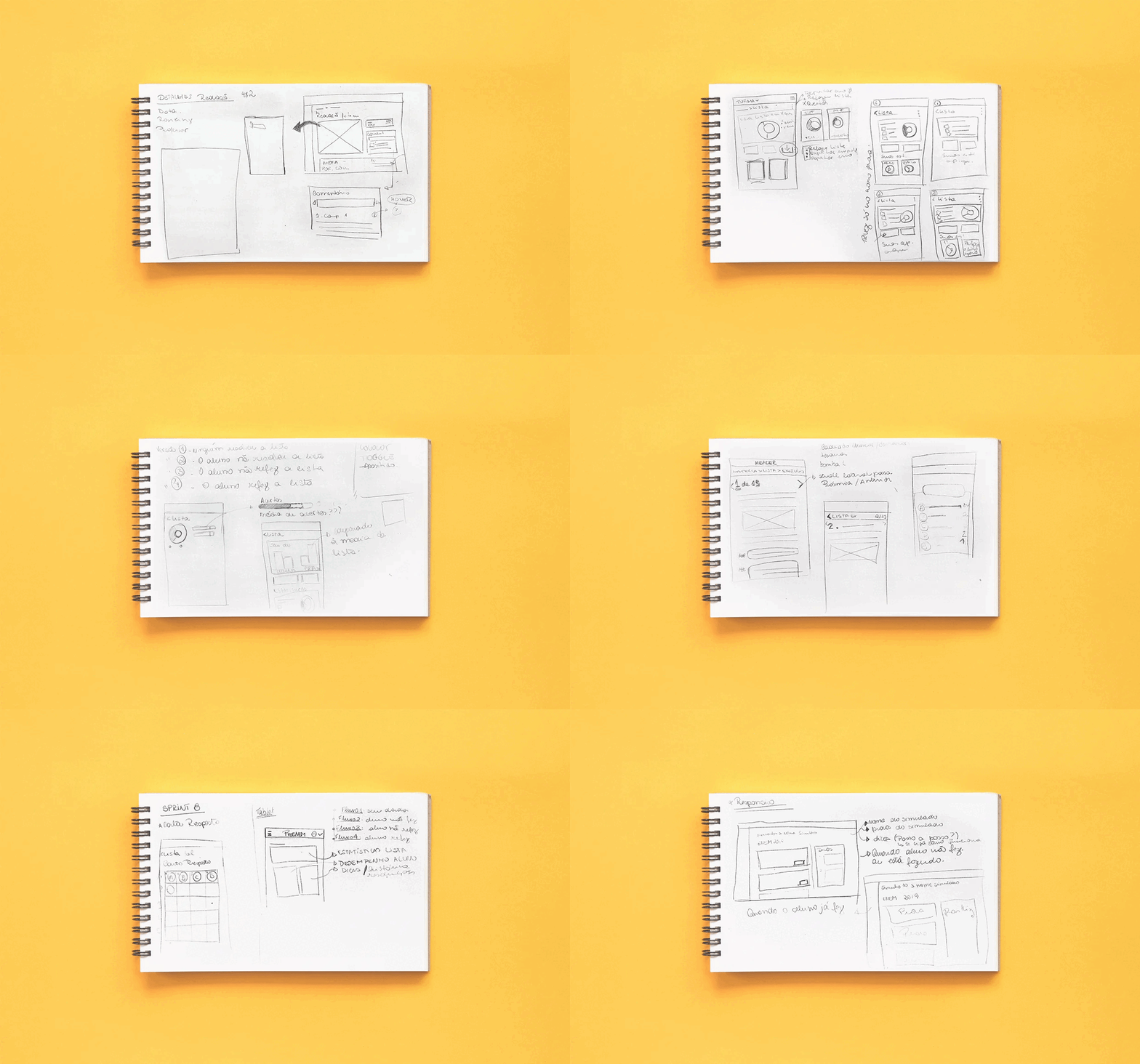
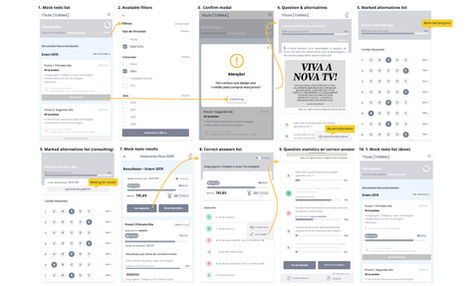
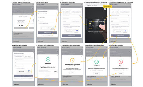
I created user flows in wireframes, organizing them by core features such as Mock Test, Subjects, Essay, and Study Plan. These flows were validated in review sessions with stakeholders, where I walked them through each step and collected feedback.
The insights gathered informed design refinements and guided priorities for the following sprints.
Delivering
With the user flows approved, I moved into crafting high-fidelity designs for each feature.
For complex interactions, I built interactive prototypes to run usability tests, ensuring a smooth and intuitive experience before handoff to developers.


This feature is designed to simulate the exam experience for users, helping them practice time management while answering new questions.

The study plan allows students to view their scheduled classes and access related content. Users can also easily see which classes are being broadcast live.

Students can practice with exercise lists in study mode, exam mode, or by redoing only the questions they answered incorrectly.

This feature is designed to simulate the exam experience for users, helping them practice time management while answering new questions.
Prototyping
I developed interactive prototypes to validate design decisions and refine the user experience before implementation.
These prototypes were used for usability testing, enabling the team to identify improvements early and ensure a smooth development process.
(Click on the GIF to view the prototype in Figma.)
Design System
To support collaboration across teams and maintain a unified brand identity for the new platform, I created the first version of the Design System.
This resource documented reusable components, visual guidelines, and interaction patterns, ensuring consistency while improving the team’s efficiency. I continued to evolve and maintain it, adapting to new features and product needs over time.
Results
Prototyting time reduced.
By implementing the Design System and streamlining workflows, the team reduced delivery time by almost 32%.
This included incorporating developer feedback early in the process to avoid rework
(Time-tracked with Monday)
Daily active users increased
Within the first quarter after launch, the number of students watching at least one class per day from their study plan increased by about 24%.
Time spent on the apps doubled
The average session length on both the App Store and Play Store grew by approximately 101% in the first year, indicating higher engagement and retention.


